The Role of Responsive Web Design in User Experience
Benefits of responsive web design for user experience
Having a strong online presence is crucial for businesses and individuals alike. With the increasing use of various devices such as smartphones, tablets, laptops, and desktops to access the internet, ensuring a seamless and enjoyable user experience across all these platforms has become a necessity. This is where Responsive Web Design (RWD) plays a pivotal role.
1. Introduction
What is Responsive Web Design (RWD)?
Responsive Web Design (RWD) is an approach to web design and development that aims to create websites that adapt and respond to different screen sizes and devices. Instead of building separate websites for each device, RWD uses flexible layouts, fluid grids, and media queries to automatically adjust the appearance and layout of a website to fit the screen it is being viewed on.
In the early days of the internet, websites were static and designed to be viewed on desktop computers. They had fixed layouts and were not optimized for other devices.
Adaptive Web Design
As the use of mobile devices increased, adaptive web design emerged as a solution. It involved creating multiple versions of a website, each designed for specific screen sizes. However, this approach had limitations as it couldn’t cater to the ever-growing range of devices.
Introduction of Responsive Web Design
With the proliferation of smartphones and tablets, the need for a more flexible and efficient approach became evident. In 2010, Ethan Marcotte introduced the concept of Responsive Web Design, revolutionizing the way websites were developed.
3. Key Principles of Responsive Web Design
Fluid Grids
Responsive websites use fluid grids that automatically adjust elements based on the screen width. This ensures that content is proportionally distributed and maintains its readability and visual appeal on all devices.
Flexible Images
Images play a crucial role in web design, and in RWD, they are sized in relative units to adapt to different screen sizes without pixelation or distortion.
Media Queries
Media queries enable websites to detect the user’s device characteristics and adjust CSS styles accordingly. This allows for customized presentation based on factors like screen resolution and orientation.
RWD makes websites accessible to a broader audience, including users with various devices and screen sizes. This inclusivity enhances the overall user experience.
Consistency Across Devices
By ensuring consistent branding and user interface elements across devices, RWD fosters familiarity and trust among users, regardless of how they access the site.
Faster Loading Times
Responsive websites are optimized to load quickly, even on mobile devices with slower internet connections. This reduces bounce rates and improves user satisfaction.
5. Mobile-First Approach
Why Mobile-First Matters
In a world where mobile internet usage surpasses desktop usage, adopting a mobile-first approach in web design is imperative. By prioritizing mobile devices, developers can create a more streamlined and efficient user experience.
Design Considerations
When designing with a mobile-first mindset, developers should focus on essential content, intuitive navigation, and touch-friendly elements.
6. Responsive vs. Mobile Apps
Pros and Cons
Responsive websites offer broad accessibility, they don’t require space on the device and their cost-effectiveness compared to developing separate mobile apps. However, native mobile apps can provide better performance and utilize device-specific features but unless you want to waste money you should never do an app unless you are going to offer functions that can’t be performed on the browser.
As technology continues to evolve, responsive web design will evolve as well. New tools and frameworks will emerge to make the development process even more efficient.
User Behavior Trends
Understanding user behavior and preferences will shape the direction of RWD, leading to more personalized and engaging experiences.
10. Conclusion
Responsive Web Design is no longer an option but a necessity for businesses and individuals looking to create a positive and consistent user experience across all devices. By adopting a mobile-first approach and following best practices, developers can build websites that cater to the diverse needs of modern users.
5 Unique FAQs
Q: How does RWD affect SEO rankings?
A: Responsive Web Design can positively impact SEO rankings by providing a better user experience, reducing bounce rates, and improving site performance across devices.
Q: Is it expensive to implement Responsive Web Design?
A: While the initial development cost might be slightly higher, RWD saves money in the long run as there’s no need to maintain separate websites for different devices.
Q: Can RWD improve my website’s conversion rates?
A: Yes, by offering a seamless and user-friendly experience, RWD can increase user engagement and, consequently, boost conversion rates.
Q: Are there any industries where RWD is particularly important?
A: RWD is essential for all industries, but it holds particular significance for e-commerce websites and businesses targeting mobile users.
Q: How frequently should I update my responsive website?
A: Regular updates are recommended to keep the website aligned with the latest technological advancements and evolving user expectations.
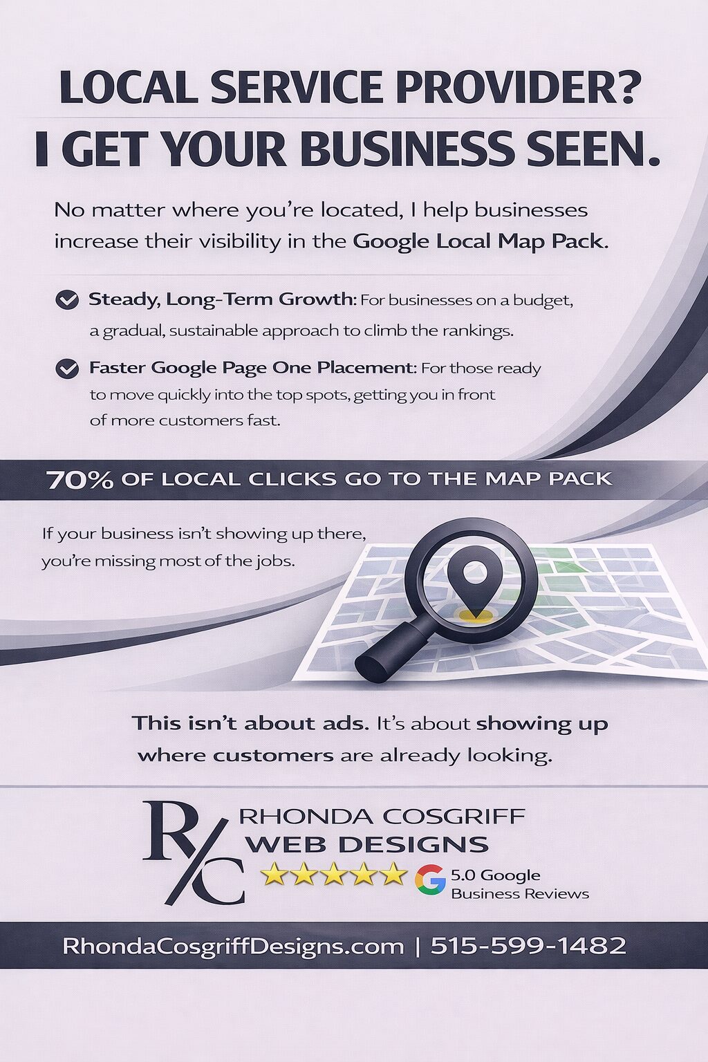
The Evolving Truth About SEO for Local Businesses: Your Website Exists for One Job — To Rank Your Google Business Profile
Rhonda Cosgriff DesignsOctober 8, 2025
Author Rhonda Cosgriff Designs
Meet Rhonda Cosgriff, the visionary owner of Rhonda Cosgriff Designs, a leading authority in the realm of web design and development, as well as small business online presence solutions. With an illustrious career spanning almost two decades in the computer systems and design field, Rhonda brings a wealth of experience and knowledge to the forefront of her craft. A trailblazer in her industry, Rhonda Cosgriff has honed her skills to perfection, consistently delivering top-notch websites that resonate with audiences and drive business growth. Her passion for creating digital experiences that captivate and inspire is evident in every project she undertakes. As a seasoned author, Rhonda channels her expertise into insightful blog articles that offer valuable guidance and expertise to business owners, and other organizations or other entrepreneurs. Her writings are a treasure trove of practical advice, industry trends, and innovative strategies that empower individuals and businesses to establish a strong and lasting online presence. With an innate ability to understand the unique needs of each client, Rhonda excels in providing end-to-end solutions for small businesses, ensuring that their journey from conceptualization to launch is seamless and successful. Her commitment to empowering entrepreneurs with the tools and knowledge to navigate the digital landscape sets her apart as a true industry leader. Rhonda is also a web3 designer who can help you transition to the new version of the internet web 3.0 and web3. When you engage with Rhonda Cosgriff Designs, you not only gain access to cutting-edge web design and development services but also tap into the expertise of a seasoned professional dedicated to your success. Let Rhonda's vision and expertise elevate your online presence to new heights.


