In the world of web design, the term “usability” holds immense importance as it encompasses the overall user experience. It’s all about how effortlessly visitors can navigate, engage with content, accomplish tasks, and access information without any hindrance. However, one crucial aspect that often gets overlooked is “accessibility,” an integral part of usability. Accessibility zeroes in on understanding the diverse skills and limitations of website visitors and how these factors shape their interactions with your site.
Let’s take a moment to ponder on this scenario: imagine a person with a visual impairment trying to make sense of your website, and then compare that to an older individual who may not be as tech-savvy. By acknowledging the different needs of various users, we can make conscious design decisions that cater to a wider audience and ensure a seamless experience for all. Prioritizing accessibility alongside usability not only improves user satisfaction but also demonstrates a commitment to inclusivity and equal access to information. So, let’s embrace the power of accessibility and unlock the full potential of our websites!
Americans with Disabilities Act (ADA) and Website Design
In addition to subjective opinions about website usability, there are also crucial regulatory guidelines to consider, especially concerning accessibility for individuals with disabilities. The Americans with Disabilities Act (ADA) establishes specific requirements for website owners to ensure that information is easily accessible, regardless of any disability or challenge that might hinder navigation.
For instance, ADA guidelines address concerns such as text size and zoom capabilities, ensuring that users can adjust the display to their needs. Moreover, websites should provide information in multiple formats, including subtitles for audio content, to accommodate users with hearing impairments.
Compliance with ADA accessibility guidelines is not only a matter of ensuring inclusivity but also crucial to avoiding potential legal issues. Failure to meet ADA requirements could lead to expensive lawsuits or fines. There are attorneys who actively seek out websites that are not ADA-compliant and file lawsuits against them.
Therefore, it is vital for website owners, including nonprofit organizations, to take ADA compliance seriously. By prioritizing accessibility in design and content creation, you can ensure that your website is inclusive and accommodating to all users, regardless of their abilities. This not only demonstrates your commitment to equal access but also safeguards your organization from potential legal ramifications.
Let’s strive for a web environment that adheres to ADA guidelines, providing equal opportunities for all visitors to engage with your content and support your nonprofit’s mission. By embracing accessibility, we can foster a more inclusive digital space and positively impact the lives of individuals with disabilities.
Why Does It Matter?
The success of your website hinges on its user-friendliness, as it directly influences visitors’ willingness to learn, engage, and participate. Imagine how frustrating it would be for potential supporters if they couldn’t even figure out how to join an email list, make a donation, or sign up for a program due to a poorly designed interface. Such obstacles not only discourage participation but might lead people to abandon these essential actions in frustration.
Considering accessibility goes beyond just catering to a few users with specific needs. By prioritizing accessibility in its broadest sense, you’re benefiting everyone who interacts with your nonprofit’s website. What proves user-friendly and accessible for one group extends its advantages to all your website visitors. When individuals from diverse backgrounds and abilities can navigate your site with ease, they are more likely to engage with your cause, support your mission, and become active participants.
You have a unique opportunity to foster inclusivity and demonstrate your commitment to all visitors. By ensuring your website is both user-friendly and accessible, you pave the way for a more connected and supportive community, driving the success of your organization’s endeavors. So, let’s embrace this approach to empower all users and create a digital space that truly benefits everyone involved.
Where Organizations Go Wrong
It may seem logical to assume that most organizations would prioritize creating user-friendly and accessible websites, given their core values and mission-driven ethos. However, the reality is not as straightforward as one might expect. Despite having the best intentions, many organizations find it challenging to adopt a user-centric perspective when it comes to their websites.
The primary culprit behind this struggle is an inherent belief that they are just like their target audience. This misconception leads them to assume that their interests, connection to the mission, and digital skills mirror those of their visitors. Unfortunately, this approach can result in a misalignment between the website’s design and the actual needs and preferences of the users.
This disconnect is not exclusive to website development; it extends to fundraising and communications as well. Organizations often face difficulties in effectively engaging with their audience and conveying their message precisely because they fail to recognize the diversity and varying levels of digital proficiency among their supporters.
Research on technology gaps offers valuable insights into this matter, revealing that many people are not as technologically savvy as one might assume. Navigating the digital landscape is not second nature to everyone, and overlooking this fact can lead to frustration and disengagement from potential supporters.
To truly thrive in the digital realm and achieve their mission, organizations must take a step back and actively embrace a user-focused approach. By understanding their audience’s unique perspectives, needs, and digital competencies, organizations can craft websites and communications that resonate, inspire, and foster deeper connections. It’s time to bridge the gap between intentions and actions and create a digital presence that genuinely serves and empowers all stakeholders.
The path to achieving more usable websites begins with a fundamental step: understanding your target audience. You must pinpoint precisely who your visitors are, what goals they aim to accomplish on your site, and how success would manifest for them. By adopting this visitor-centric approach, you can unleash the true potential of your website and provide the utmost assistance to your audience.
Neglecting usability from your visitor’s perspective can lead to a significant disconnect between your intentions and the actual user experience. While you might believe your website is helpful, it might not align with what your visitors truly need or expect. Therefore, it’s imperative to immerse yourself in the mindset of your audience, comprehend their motivations, challenges, and desires, and then mold your website to cater to those specific needs.
When your website is designed with the visitor at its core, it becomes a powerful tool that effortlessly guides users toward accomplishing their objectives. Each click, each interaction becomes seamless, intuitive, and rewarding, leaving visitors satisfied and eager to return. Embracing usability from the visitor’s perspective not only enhances user experience but also bolsters your credibility and strengthens your connection with your audience.
So, let’s take the leap towards a user-focused approach, where your website becomes a valuable ally for your visitors, leading them towards success and making a meaningful impact on their journey. Remember, a well-designed website isn’t just aesthetically pleasing; it’s a finely tuned instrument that harmonizes with the needs and aspirations of those it serves.
7 Characteristics of a User-Friendly Website
Clear Structure, Navigation and Page Names
A well-crafted website possesses a clear and intuitive structure, navigation, and page names, ensuring that visitors can easily explore every corner without any guesswork.
Clear Page Names: Avoid confusing jargon or unfamiliar abbreviations in page names. Choose descriptive and straightforward titles that provide a clear indication of the content within. This way, visitors can quickly grasp what to expect from each page.
Organized Website Structure: A user-friendly website presents information in a logical and organized manner. Create a straightforward structure that guides visitors smoothly through your site’s offerings. Ensure that related pages are grouped together, fostering easy navigation.
Simplified Navigation: An overloaded navigation menu can overwhelm users. Opt for a streamlined approach, offering broad topics that lead to more specific sub-pages. This way, visitors can explore your site with ease and quickly find what they’re looking for.
No Dead Ends: Prevent visitors from hitting dead ends by ensuring that all pages have relevant links to related content. Avoid orphaned pages without any clear path for exploration. Additionally, be vigilant about 404 error pages, and provide a helpful redirect or error page to retain users’ interest.
By incorporating these user-friendly characteristics, you can create a website that seamlessly guides visitors, regardless of where they land, making their experience enjoyable and frustration-free. A clear and structured site empowers your audience to engage deeply with your content, reinforcing their connection to your mission and fostering a positive impression of your nonprofit organization.
Responsive and Compatible Design
In the dynamic digital landscape, it’s vital for your organization’s website to embrace responsive and compatible design principles, ensuring a seamless experience for all users across various devices and web browsers. Let’s explore the key reasons why these design features are crucial for your website’s success:
Adaptability to Different Devices: With the multitude of devices available for browsing, your website must shine on every screen size. Responsive design enables your site’s navigation to adjust effortlessly, accommodating desktop computers, tablets, and mobile phones alike. This versatility ensures that users can access your content comfortably, regardless of the device they use.
Optimized Text and Images: A user-friendly website automatically reformats and resizes text and images, ensuring readability and proper spacing across different devices. By avoiding text on top of images, you enhance accessibility and make it easier for users to engage with your content, boosting overall user satisfaction.
Mobile-Friendly for Search Engines: Embracing responsive design is not only beneficial for users but also for search engines like Google. Mobile-friendly websites receive high marks from search engines, leading to improved search result rankings. This increased visibility ensures that your pages reach a broader audience, enhancing your nonprofit’s online presence and impact.
By integrating responsive and compatible design elements, you demonstrate your commitment to providing a stellar user experience for all visitors. A website that adjusts flawlessly to various devices showcases your dedication to inclusivity and accessibility, fostering positive interactions with your audience and leaving a lasting impression. Let’s harness the power of responsive design to create a digital space that captivates and engages users, maximizing the reach and influence of your organization’s mission.
Consistent Look That’s Scannable
Consistent Style Guide: An effective style guide serves as a blueprint for how your website content should appear. Consistency in fonts, colors, and formatting throughout the site fosters a sense of familiarity and reliability for users. A clear style guide also streamlines the content creation process, making it easier for your team to produce cohesive and visually appealing pages. You may
Digestible Content Formats: Avoid overwhelming visitors with lengthy blocks of text. Instead, break down information into easily digestible portions. Incorporate headings, subheadings, small paragraphs, and bulleted lists to organize content and guide readers through the page effortlessly.
Priority of Information: Present the most critical information upfront, ensuring that visitors quickly grasp the essence of each page. Secondary details can follow, providing additional context and supporting information. This approach caters to users’ preferences for concise and impactful content.
Embrace White Space: White space, also known as negative space, is the uncluttered area around elements on your website. Embracing white space allows content to breathe, making it more visually appealing and enhancing the focus on essential elements. It also reduces cognitive overload, making it easier for visitors to absorb information.
Contrasting Colour Scheme
The contrast between the background and content is a fundamental web design principle that should never be underestimated. Achieving the right contrast is crucial for ensuring a user-friendly and accessible website.
Adequate contrast, such as black text on a white background, enhances the legibility of your content, making it effortless for visitors to read and engage with your information. Clear and distinct contrast creates a harmonious visual experience that allows users to navigate your website with ease and absorb the content comfortably.
Conversely, insufficient contrast can be detrimental to the user experience, making it challenging for visitors to read your content. Low contrast between the background and text strains the eyes and creates a barrier for individuals with visual impairments. This can lead to frustration and disengagement from your website, resulting in a negative impact on your organization’s goals.
By prioritizing contrast in your web design, you demonstrate your commitment to providing an accessible and inclusive experience for all users. Ensuring that your content is easily readable reflects your organization’s dedication to effective communication and enhances the overall usability of your website.
Let’s pay careful attention to the contrast between background and content to create a visually pleasing and user-friendly website. By making this simple yet critical design consideration, we can optimize the readability of your content and foster a positive and enjoyable experience for all visitors to your nonprofit’s digital platform.
The right contrast between the background of the website and content is one of the most basic yet most important web design principles that should never be overlooked. Good contrast between background and text e.g. black text on a white background makes your content legible and easy to read. Lack of contrast, on the other hand, makes it very difficult for visitors to read your content.
By incorporating these content-focused strategies, you can deliver a user-friendly website that captivates and retains visitors. An organized, visually appealing site with easily digestible content demonstrates your commitment to providing a seamless user experience, fostering trust and engagement. Let’s harness the power of thoughtful content presentation to create a web presence that leaves a lasting and positive impression on your audience, driving support and success for your nonprofit organization.
Buttons should be large enough
When it comes to button design, size plays a significant role in enhancing the user experience. Based on research studies, it is recommended to adhere to specific button size guidelines to ensure accessibility and optimal touch accuracy.
Buttons should never be smaller than 42 pixels and should not exceed 72 pixels in size. The most preferred button size is 60 pixels, providing a balance between usability and touch accuracy for most users. However, for certain demographics, especially older users, a larger button size of 72 pixels is optimal.
Larger buttons, such as the 72-pixel size, are favored by older users and generally result in the highest touch accuracy. By offering a more substantial target area, larger buttons reduce the likelihood of accidental taps and increase the overall ease of interaction, especially for those with less precise touch input.
Considering these button size recommendations can significantly impact the accessibility and user-friendliness of your website or app. Ensuring that buttons are designed with appropriate dimensions makes it easier for users to interact with your interface, encouraging engagement and improving the overall user satisfaction.
Let’s prioritize button design that aligns with these size guidelines, catering to the needs of diverse users and enhancing the overall usability of your digital platform. By implementing buttons with the right size, we can create a seamless and enjoyable experience for all visitors, irrespective of their age or touch accuracy.
Easily Recognizable Links
If you can click on it, it should look clickable. And people should have a good idea of where they are going when they use a link. A user-friendly website not only offers recognizable links—it uses links throughout its pages to help move visitors around to similar content.
Links use descriptive anchor text (the words used in the link itself) instead of “click here.”
It’s easy to tell where links are because they are underlined, show in a different color or use a button.
It’s obvious when a link is going to send someone to a completely different website.
On mobile devices, phone numbers show up as links that can be clicked to dial.
Clear Calls to Action
Creating actionable calls to action (CTAs) is essential for a successful nonprofit website. Let’s explore some key practices to make your CTAs user-friendly and compelling:
Compelling Selling Point: Craft CTAs that combine a powerful selling point, such as “save lives,” with a clear and obvious next step, like “donate now.” The language should inspire action and convey the impact of the visitor’s participation.
Easy to Find: Ensure your CTAs are prominently displayed and easy to find throughout your website. Highlight them in the navigation, feature them in a sidebar, or use noticeable buttons that stand out from the rest of the content.
Clear Expectations: Set transparent expectations for visitors when they click on a CTA. Avoid confusion or frustration by ensuring that clicking a CTA leads users to the expected destination. For instance, if a CTA invites them to register for an event, make sure it takes them directly to the event registration page.
Design Best Practices: Adhere to design best practices for your CTAs, including readable text size and contrasting colors. The text should be legible and easy to read, and the colors should draw attention without clashing with the overall design.
Focus on Singular CTAs: Avoid overwhelming visitors with multiple CTAs on a single page. Keep the focus clear and concise by presenting one primary CTA that aligns with the page’s purpose. This approach directs visitors towards the intended action and avoids decision paralysis.
By incorporating these user-friendly CTA practices, your nonprofit website can effectively drive engagement, increase donations, and encourage supporters to take meaningful action. Remember, actionable and compelling CTAs are powerful tools to inspire positive change and propel your nonprofit’s mission forward. Let’s create a web experience that motivates visitors to make a difference and be part of your organization’s transformative impact.
Simple Forms
User-friendly forms are essential for seamlessly collecting information from website visitors, whether for email newsletter subscriptions or membership payments. By implementing thoughtful design, you can ensure a smooth and efficient form completion process, reducing the likelihood of losing potential respondents. Consider the following best practices to create user-friendly forms:
Relevant Information Requests: Only ask for information that is necessary for your intended purpose. Avoid overwhelming visitors by requesting more data than you genuinely need. Additionally, avoid making certain fields mandatory if they aren’t crucial to the form’s purpose.
Logical and Sequential Presentation: Organize form fields in a logical and sequential manner. Group similar questions together to create a clear and intuitive flow for users as they progress through the form. This approach minimizes confusion and enhances the overall user experience.
Obvious Submission Method: Make it easy for users to find the submission button and complete the form. The submission button should be prominently displayed and clearly labeled. After submission, provide a reassuring message confirming that their information was successfully received.
By adhering to these form design principles, you can streamline the data collection process, encouraging more visitors to complete and submit forms. A user-friendly form experience demonstrates your organization’s commitment to respecting users’ time and privacy, ultimately building trust and engagement with your audience. Let’s create forms that efficiently gather essential information while ensuring a positive interaction with your nonprofit’s website, fostering a lasting connection with your valued supporters.
Accessible and Adaptive
In creating a user-friendly website that caters to visitors with different abilities, it’s essential to consider factors that may not be immediately apparent. By envisioning how assistive and adaptive tools interact with your content, you can ensure a more inclusive and accessible web experience. Let’s explore key practices to make your website accommodating to all users:
Inclusive Images and Videos: Ensure that images have descriptive alternative text (alt text) and, where applicable, captions to convey their content to those using screen readers or assistive technologies. For videos, provide subtitles or a transcript to make the content accessible to individuals with hearing impairments.
Keyboard Navigable Forms: Design forms in a way that allows users to navigate through form fields using only the keyboard. This ensures that visitors who rely on keyboard navigation or other input devices can easily interact with your forms.
Clear and Readable Content: Opt for easy-to-read text with descriptive headings, avoiding dense technical language that may pose challenges for some users. Well-structured content with informative headings aids users in comprehending the information and navigating your website efficiently.
Consistent and High Contrast Formatting: Maintain consistent formatting across your pages, making it easier for users to predict the layout and locate relevant information. Incorporate high contrast colors to highlight links and icons representing themes or topics, improving visibility for individuals with visual impairments.
By implementing these practices, you enhance the accessibility of your website, making it more user-friendly for all visitors, including those using assistive and adaptive tools. Embracing inclusive design not only demonstrates your commitment to diversity and accessibility but also ensures that your website becomes a welcoming space for a broader audience. Let’s create a web environment that caters to the needs of all users, fostering inclusivity and reinforcing your nonprofit’s dedication to serving everyone in your community.
Creating a user-friendly website is a pivotal aspect that goes hand in hand with the aesthetics of your site. Usability plays a crucial role in transforming your website into a powerful marketing and fundraising tool, driving actions that align with your organizational goals.
If your current website is struggling to perform as desired, it might be time to prioritize usability by making necessary adjustments or exploring new platforms that prioritize user experience. A user-focused approach can revitalize your website, enhancing engagement and encouraging visitors to take meaningful actions that support your cause.
For those embarking on the journey of building a new website from scratch, don’t underestimate the significance of user-friendly characteristics during the design process. By considering usability from the outset, you lay the foundation for a website that seamlessly guides visitors, maximizes conversions, and strengthens your nonprofit’s impact.
The rewards of investing in a user-friendly website are significant. Your visitors will appreciate the thoughtful and intuitive experience, which will be reflected both in their words of praise and their active engagement with your organization. Embracing usability not only bolsters your online presence but also reinforces your commitment to creating a positive and accessible platform for all users.
Let’s prioritize usability to create a web environment that captivates, empowers, and compels visitors to support your mission and contribute to your nonprofit’s success. With a user-friendly website, you can unlock the full potential of your digital presence and make a lasting impression on your valued audience.
Discover more from Rhonda Cosgriff Web Designs
Subscribe to get the latest posts sent to your email.
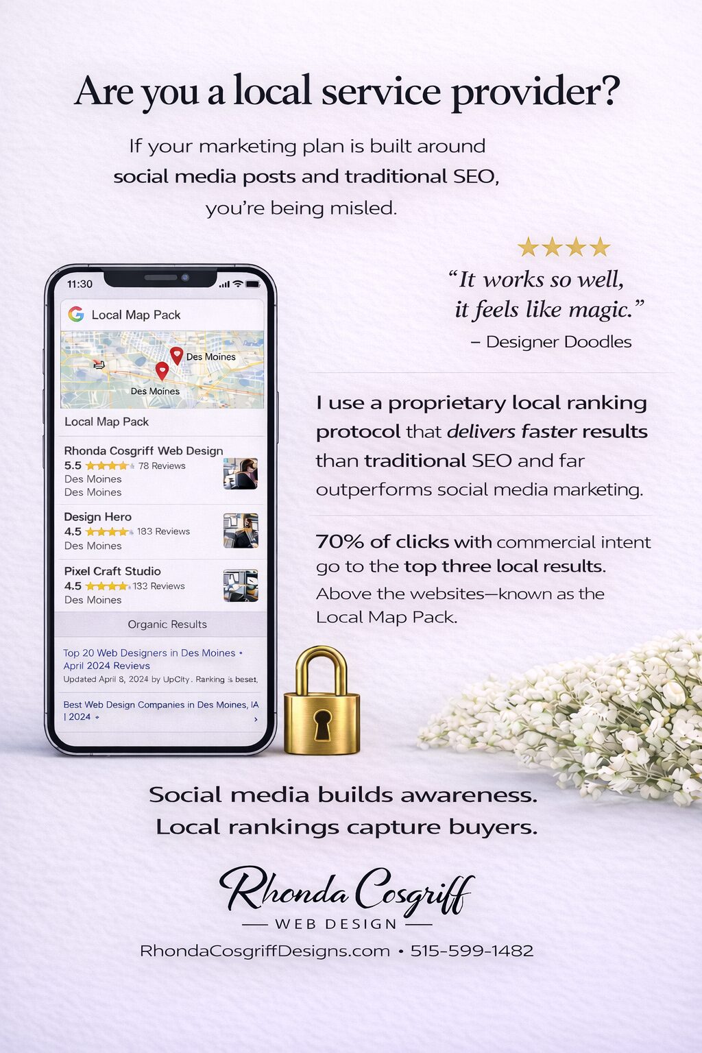
Are You a Local Service Provider? Here’s How Customers Actually Find You
Rhonda Cosgriff DesignsJanuary 19, 2026
Author Rhonda Cosgriff Designs
Meet Rhonda Cosgriff, the visionary owner of Rhonda Cosgriff Designs, a leading authority in the realm of web design and development, as well as small business online presence solutions. With an illustrious career spanning almost two decades in the computer systems and design field, Rhonda brings a wealth of experience and knowledge to the forefront of her craft. A trailblazer in her industry, Rhonda Cosgriff has honed her skills to perfection, consistently delivering top-notch websites that resonate with audiences and drive business growth. Her passion for creating digital experiences that captivate and inspire is evident in every project she undertakes. As a seasoned author, Rhonda channels her expertise into insightful blog articles that offer valuable guidance and expertise to business owners, and other organizations or other entrepreneurs. Her writings are a treasure trove of practical advice, industry trends, and innovative strategies that empower individuals and businesses to establish a strong and lasting online presence. With an innate ability to understand the unique needs of each client, Rhonda excels in providing end-to-end solutions for small businesses, ensuring that their journey from conceptualization to launch is seamless and successful. Her commitment to empowering entrepreneurs with the tools and knowledge to navigate the digital landscape sets her apart as a true industry leader. Rhonda is also a web3 designer who can help you transition to the new version of the internet web 3.0 and web3. When you engage with Rhonda Cosgriff Designs, you not only gain access to cutting-edge web design and development services but also tap into the expertise of a seasoned professional dedicated to your success. Let Rhonda's vision and expertise elevate your online presence to new heights.