Mobile-First Design: Best Practices for Optimizing Your Website Design for Mobile Devices
Table of contents
In today’s digital age, more and more people are accessing websites through mobile devices such as smartphones and tablets. In fact, according to recent statistics, 80% of internet users own a smartphone, and 57% of all web traffic comes from mobile devices. This makes it essential for businesses to optimize their website design for mobile devices to ensure they are reaching as many potential customers as possible.
One approach to designing websites with mobile users in mind is mobile-first design. This technique involves designing a website for mobile devices first, then scaling it up for larger screens. In this article, we will discuss best practices for designing a mobile-first website to help you optimize your website design for mobile devices.
What is Mobile-First Design?
Mobile-first design is an approach to website design that prioritizes the needs of mobile users. It involves designing a website for mobile devices first, then scaling it up for larger screens such as desktops and laptops. The idea is to create a website that is easy to use and navigate on smaller screens, and that provides a seamless user experience across all devices.
Why is Mobile-First Design Important for Your Website?
Mobile-first design is important for several reasons:
Increased Mobile Usage: With the increasing popularity of smartphones and tablets, more and more people are using mobile devices to access the internet. By designing your website with mobile users in mind, you can ensure that your website is optimized for the devices that most people are using to access the internet.
Better User Experience: Mobile-first design prioritizes the needs of mobile users, which often results in a better user experience. By designing a website that is easy to use and navigate on smaller screens, you can improve the overall user experience of your website.
Higher Search Engine Rankings: Search engines like Google prioritize websites that are mobile-friendly in their search results. By designing your website with mobile users in mind, you can improve your website’s search engine rankings and attract more organic traffic to your website.
Best Practices for Mobile-First Design
Here are some best practices for designing a mobile-first website:
Keep It Simple
When designing a website for mobile devices, it’s important to keep things simple. Mobile screens are smaller, which means there is less room for clutter and unnecessary elements. Here are some ways to keep your mobile website design simple:
Minimize Clutter: Avoid using too many images, videos, and other visual elements that can clutter up your website and make it difficult to navigate.
Use Easy-to-Read Fonts: Choose fonts that are easy to read on small screens. Avoid using fonts that are too small or too complex.
Simplify Navigation: Use simple navigation menus that are easy to use and navigate on smaller screens.
Prioritize Your Content
Mobile users are often looking for specific information when they visit a website. It’s important to prioritize your content and make it easy to find on your mobile website. Here are some ways to prioritize your content:
Use Clear Headings and Subheadings: Use headings and subheadings to break up your content and make it easy to scan on small screens.
Emphasize Important Content: Use bold text and other visual cues to highlight important content on your website.
Avoid Long Paragraphs: Use shorter paragraphs and bullet points to make your content more readable on small screens.
Use Responsive Design
Responsive design is a design approach that allows your website to adapt to different screen sizes and devices. It involves using flexible layouts, images, and other elements that can adjust to different screen sizes. Here are some benefits of responsive design:
Improved User Experience: Responsive design ensures that your website looks and functions properly on all devices, which improves the overall user experience.
Cost-Effective: Rather than creating multiple versions of your website for different devices, responsive design allows you to create one website that works for all devices.
Better SEO: Responsive design is a Google-recommended design pattern, and can help improve your website’s search engine rankings.
Optimize Your Images
Images are an important part of any website design, but they can also slow down your website’s load times on mobile devices. To optimize your images for mobile devices, consider the following:
Use Compressed Images: Compressed images take up less space and load faster on mobile devices.
Use the Right File Type: Different file types (such as JPEG, PNG, and GIF) have different sizes and load times. Choose the right file type for each image on your website.
Use the Right Size: Scale your images to the appropriate size for the device they will be viewed on.
Test Your Website on Multiple Devices
To ensure that your mobile-first design is effective, it’s important to test your website on multiple devices. This will allow you to identify any issues with your website design and make adjustments as needed. Here are some tips for testing your website on multiple devices:
Use Emulators: Emulators allow you to test your website on different devices without physically owning them.
Test Different Screen Sizes: Test your website on devices with different screen sizes to ensure that it looks good on all devices.
Test Load Times: Test your website’s load times on different devices to ensure that it loads quickly on all devices.
FAQs
Q: What is mobile-first design? A: Mobile-first design is an approach to website design that prioritizes the needs of mobile users. It involves designing a website for mobile devices first, then scaling it up for larger screens.
Q: Why is mobile-first design important? A: Mobile-first design is important because it ensures that your website is optimized for the devices that most people are using to access the internet. It also often results in a better user experience and can improve your website’s search engine rankings.
Q: What are some best practices for mobile-first design? A: Some best practices for mobile-first design include keeping your website design simple, prioritizing your content, using responsive design, optimizing your images, and testing your website on multiple devices.
Conclusion
Optimizing your website design for mobile devices is essential in today’s digital age. By using mobile-first design and following best practices, you can create a website that is easy to use and navigate on smaller screens, and that provides a seamless user experience across all devices. Keep things simple, prioritize your content, use responsive design, optimize your images, and test your website on multiple devices to ensure that your mobile-first website is effective and engaging for your users.
Discover more from Rhonda Cosgriff Web Designs
Subscribe to get the latest posts sent to your email.
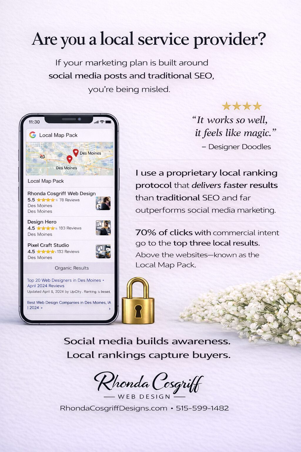
Are You a Local Service Provider? Here’s How Customers Actually Find You
Rhonda Cosgriff DesignsJanuary 19, 2026
Author Rhonda Cosgriff Designs
Meet Rhonda Cosgriff, the visionary owner of Rhonda Cosgriff Designs, a leading authority in the realm of web design and development, as well as small business online presence solutions. With an illustrious career spanning almost two decades in the computer systems and design field, Rhonda brings a wealth of experience and knowledge to the forefront of her craft. A trailblazer in her industry, Rhonda Cosgriff has honed her skills to perfection, consistently delivering top-notch websites that resonate with audiences and drive business growth. Her passion for creating digital experiences that captivate and inspire is evident in every project she undertakes. As a seasoned author, Rhonda channels her expertise into insightful blog articles that offer valuable guidance and expertise to business owners, and other organizations or other entrepreneurs. Her writings are a treasure trove of practical advice, industry trends, and innovative strategies that empower individuals and businesses to establish a strong and lasting online presence. With an innate ability to understand the unique needs of each client, Rhonda excels in providing end-to-end solutions for small businesses, ensuring that their journey from conceptualization to launch is seamless and successful. Her commitment to empowering entrepreneurs with the tools and knowledge to navigate the digital landscape sets her apart as a true industry leader. Rhonda is also a web3 designer who can help you transition to the new version of the internet web 3.0 and web3. When you engage with Rhonda Cosgriff Designs, you not only gain access to cutting-edge web design and development services but also tap into the expertise of a seasoned professional dedicated to your success. Let Rhonda's vision and expertise elevate your online presence to new heights.


